The Design Team for WordCamp Europe 2020 consists of five members: Carola from Italy, Tammie from the UK, Estela from the Netherlands, Roberto from Spain, and Helder from Portugal.
For the 8th edition of WordCamp Europe, we chose to re-imagine the logo, replacing the vision that was originally created by this year’s Design Team Lead, Tammie, back in 2013 for the first ever WordCamp Europe.
WCEU trivia: The original logo was never intended to “stick” long-term, and its evolution was well overdue!
The task was to create a new logo, as well as colours, typography, and visual elements that would stand the test of time, influenced by the history of WCEU whilst also looking forward. The Design Team worked to create an identity with elements that could be adapted to any location, starting with our home for 2020, Porto.
The starting shape
The process started with the team thinking about the long-standing, passionate history of WordPress communities in Europe, and WordCamp Europe as an event.

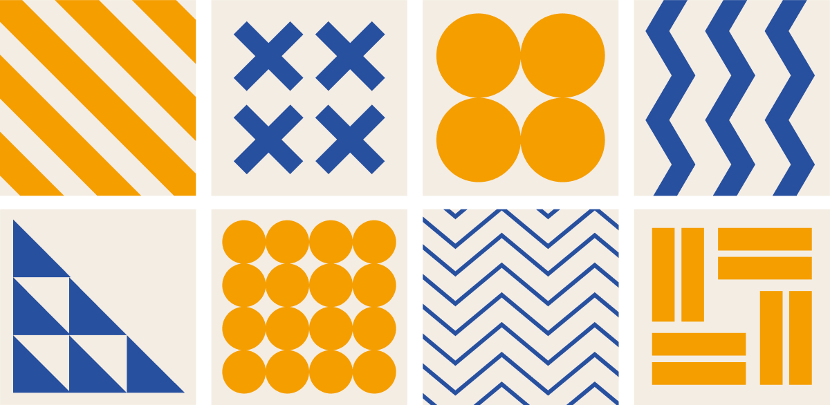
The next step was to find the visual elements that could be used in the logo, which led to the decision to reduce back to the simple form of geometric shapes.
When joined into patterns, visuals began to form. These geometric patterns are seen throughout Europe in tiles, particularly in Portuguese Azulejos.

Growing the identity
The second step was to build up from the foundational meaning. We tried using the letters W, C, E and U in Morse code and in binary code, but didn’t see the WordCamp spirit in either iteration:

We also explored the number 28, to represent the countries of the European Union with a simple dot calling back to the original WordCamp Europe logo, but the team at WCEU discussed how Europe reaches beyond those 28 countries. Our event is global and the European WordPress community includes non-EU countries such as Serbia, the country that was home to WCEU 2018, which took place in Belgrade.
As a result, we looked at how data and numbers could be represented more accurately, instead choosing the number of WCEU events so far. Each dot represents a WordCamp, and a story. It’s a personal, adaptable and powerful visual. Each camp, marked in time, has added its own stamp on the WordCamp Europe brand.
Exploring this led to the addition of the underscore as a symbol of continuity, visually representing the story we are writing and a story that continues with every WordCamp edition.
This has a strong visual identity and meaning: an expression of the future linking to the past.

The final element of the square brought us back to wrapping around, bonding and cohesion. We are a community joined together. As this evolved, an opening was made, moving beyond boundaries and providing space for our guiding WordPress ‘W,’ our beacon, and an indication of WordCamp Europe 2020’s colours.
The final form
Introducing the new logo and brand identity for WordCamp Europe:

Just like the identity evolves based on location, the shape can change based on format. This means it will be robust for the future whilst still keeps the strength of the brand. Here are versions for social media and down to the smallest size.


Branding for 2020
Each year, specific branding is created for WordCamp Europe, with a focus on elements and colours.

Colours are an element that are changed every year. For Porto, we picked a warm yellow, because this is the first colour that makes people think of Portugal, with the blue of the ocean.
The design elements have their roots strongly in the Azulejos tiles. These patterns are our grounding elements to be reflected across everything done with this year’s identity.
Beyond 2020
Any identity for WordCamp Europe needs to stand the test of time, so the future featured heavily in our vision for the new mark.
Here you can see how the logo could evolve, adding dots (locations, stories) for future WordCamps in imagined locations:

Closing & feelings
Our team is very proud of the results we have achieved. We worked closely on this and realised our goal of creating a symbol that has meaning, that will serve its purpose for many years to come, is recognisable and can be used in different ways.
Creating an identity is like telling a story. For us, this year’s visual identity helps us tell the WordCamp Europe story loud and clear.
Nicely done! Love the story about the brand identity.
Little mistake about WCEU 2019 was not in Belgrade but in Berlin. 🙂
Hey Aurélien! You’re absolutely right, I’ve just updated that detail. If I said you found the Easter egg, would you believe me? Thanks for your kind words!
Thx for your hard work on that new logo, but I’ve to say, I don’t like it.
And that’s cause of two things:
1. It doesn’t represent the whole European WordPress Community like the old on, cause it’s only about the City’s who already hosted WCEU.
2. Someone who is not aware of the story behind the logo, will have no clue that the logo without subline represents the WordCamp Europe community. It just looks like some sort of a dice. There is no Europe in it 🙁
Absolutely! 😀
I like the brand story,and how it evolved towards the current logo.The Azulejos, the connecting dots, the standalone ‘W’ and all of that, beautiful.
Great job team! The explanation, the story behind the design, the reasoning, left me speechless.
This looks amazing. I love the storytelling of the process, too.
Very nice, thank you for sharing the creation process
Nice! Love the patterns! Looking forward to seeing the design in action!
Congratulations! I really appreciate the effort, meaningful, creativity and story behind this wonderful logo.
Great. Thank your for your explanations!
Oh this is nice! I really like the deep sense behind and open view for future in it 🙂 Good work guys!